Stem-and-Leaf Plots
Frequency Tables
� Raw Data � Uniform Class Intervals � Nonuniform Class Intervals
Histograms
The stem-and-leaf plot is an excellent way to start an analysis. To construct a stem-and-leaf plot:
To illustrate stem-and-leaf plots, let us consider a data set with the following numerical values:
21, 42, 5, 11, 30, 50, 28, 27, 24, 52
To start, draw a stem-like axis that extends from the data set's minimum to its maximum:
|5|
|4|
|3|
|2|
|1|
|0|
(x 10)
An axis multiplier (x 10) is included to allow the viewer to decipher the value of each data point.
The rightmost digit of each data point (the "leaf") is then plotted against the stem-like axis. For example, a value 21 is plotted as:
|5|
|4|
|3|
|2|1
|1|
|0|
(x 10)
The remaining data points are plotted:
|5|02
|4|2
|3|0
|2|1874
|1|1
|0|5
(x 10)
Data are now sorted in approximate rank order, and the shape, location and spread of the distribution are evident. I'm going to flip the stem-and-leaf to a horizontal orientation to better display these features.
The location of the data can be summarized by its center. For example, the center of the above stem-and-leaf plot is located between 20 and 30.
4
7
8 2
5 1 1 0 2 0
------------
0 1 2 3 4 5
------------
^
Center
The spread of the distribution is seen as the dispersion of values around the distribution's center.
4
7
8 2
5 1 1 0 2 0
------------
0 1 2 3 4 5
------------
<----|---->
Spread
The shape of the distribution can be seen as a "skyline silhouette" of the data.
X
X
X X
X X X X X X
------------
0 1 2 3 4 5
------------
Notice the "skyscraper" in the middle of the distribution. This peak represents the distribution's "mode." The mode of this particular data set in the interval 20 to 30. Also notice that the data demonstrate pretty-good symmetry around the mode. (Nothing is perfect in statistics, especially when the sample is small.)
With a little practice, a distribution's shape, location, and spread can be visualized through the stem-and-leaf plot.
Second Illustrative Example of a Stem-and-Leaf Plot: The next illustrative example shows how a stem-and-leaf plot can be modified to accommodate data that might not immediately lend itself to this type of plot. Consider this new data set:
1.47, 2.06, 2.36, 3.43, 3.74, 3.78, 3.94
These data have 3 significant digits and a decimal point. In such instances, we first round the data to two significant digits. The data set rounded to two significant digits is: {1.5, 2.1, 2.4, 3.4, 3.7, 3.8, 3.9}. When plotting these points, decimal points are ignored. Using stem values of 1, 2, and 3, we plot:
|1|5
|2|14
|3|4789
(x 1)
Realizing that this plot is somewhat squashed, we could spread it out by splitting the stem using double values with the first value reserved for leaf-values between 0 and 4 and the second stem-value reserved for leaf-values between 5 and 9. Here's the same data with double stem-values:
|1|
|1|5
|2|14
|2|
|3|4
|3|789
(x 1)
This shows that there is more than one correct way to plot a stem-and-leaf diagram for a given data set.
SPSS: To create a stem-and-leaf plot in SPSS, click on Statistics | Summarize | Explore and select the variable you want a stem-and-leaf plot of in the "Dependent List" dialogue box.
It is often useful to consider data in the form of a frequency table. Frequency tables may include three different types of frequencies. These are:
An example of a table of AGE frequencies is:
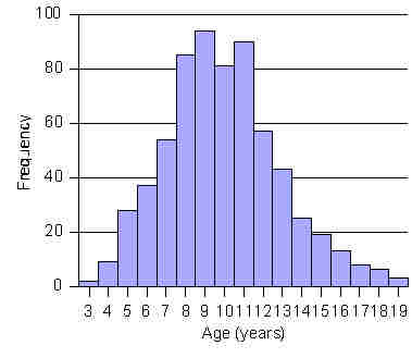
AGE | Freq Rel.Freq Cum.Freq.
------+-----------------------
3 | 2 0.3% 0.3%
4 | 9 1.4% 1.7%
5 | 28 4.3% 6.0%
6 | 37 5.7% 11.6%
7 | 54 8.3% 19.9%
8 | 85 13.0% 32.9%
9 | 94 14.4% 47.2%
10 | 81 12.4% 59.6%
11 | 90 13.8% 73.4%
12 | 57 8.7% 82.1%
13 | 43 6.6% 88.7%
14 | 25 3.8% 92.5%
15 | 19 2.9% 95.4%
16 | 13 2.0% 97.4%
17 | 8 1.2% 98.6%
18 | 6 0.9% 99.5%
19 | 3 0.5% 100.0%
------+-----------------------
Total | 654 100.0%
SPSS: To create a frequency table in SPSS, click on Statistics | Summarize | Frequencies and select the variable you want a frequency table of in the "Variable(s):" dialogue box.
As an additional example, let us reconsider the data set {21, 42, 5, 11, 30, 50, 28, 27, 24, 52}. A frequency table for this data set is:
Value Talley Freq. RelFreq CumFreq
------ ------ ----- -------- -------
5 / 1 10% 10%
11 / 1 10% 20
21 / 1 10% 30%
24 / 1 10% 40%
27 / 1 10% 50%
28 / 1 10% 60%
30 / 1 10% 70%
42 / 1 10% 80%
50 / 1 10% 90%
52 / 1 10% 100%
------------------------------------------
TOTAL 10 100% --
Because of the small size of the sample, this frequency table is not particularly useful. For it to become more useful, data must be grouped into class intervals.
It is often difficult to learn much by looking at a frequency listing of values when the dataset is small so that each value in the data set appears only once or twice. To address this problem, we condense the data into class interval groupings.
There are no hard-and-fast rules for determining appropriate class intervals. Nevertheless, here are some rules-of-thumb by which to begin:
(A) Decide on an appropriate number of class-interval groupings: The optimum number of class groupings will depend on the range of values and the size of the data set. In general, large data sets can support a large number of class groupings and small data sets can support fewer. Deciding on a suitable number of class-intervals may require some trial and error. To start, try class-intervals that are of equal and convenient length (e.g., 10-year age intervals) or have substantive meaning (e.g., hypotensive / normotensive / borderline hypertensive / hypertensive). Normally, 4 to 12 class-intervals is usually sufficient.
(B) Determine the class interval width. This can be determined with the formula:
Class-interval width = (maximum value - minimum value) / (no. of desired class groupings)
For example, to create 8 class groupings for a data set with a maximum of 19 and minimum of 3, the class interval width = (19 - 3) / 8 = 2.
(C) Set endpoint conventions. If an observation falls on the boundary between two class intervals, we need know in which class interval it will be counted. The two choices are to: (a) include the left boundary and exclude the right boundary or (b) include the right boundary and exclude the left boundary. When faced with this choice, we will use the option "a". For example, when consideration a two unit interval of 2 to 4, we will exclude the right boundary of 4, so that the interval is between 2 (inclusive) up to 4 (exclusive).
(D) Tabulate the data: Once boundaries are established, the data are counted in the usual way.
A frequency table for the small data set {21, 42, 5, 11, 30, 50, 28, 27, 24, 52} with 15-year age class-interval grouping can now e shown:
Range Tally Freq. RelFreq CumFreq
------ ------ ----- -------- -------
0-14 // 2 20% 20%
15-29 //// 4 40% 60%
30-44 // 2 20% 80%
45-54 // 2 20% 100%
------------------------------------------
TOTAL 10 100% --
SPSS: To group data in SPSS, click on Transform | Recode | Into Different Variable. This will allow you to set up ranges to serve as class intervals. After recoding the data to these new class intervals (ranges), a Statistics | Summarize | Frequencies command can be directed against the newly recoded variable.
At times we might want to use nonuniform class-intervals when describing frequencies. For example, we may want to look at age distribution of children with ages grouped as preschool (2-4 years), elementary school (5-11-years), middle-school (12-13-years), and highschool (14-19-years). The data from Table 1 can now be displayed as follows:
AGEGRP | Freq RelFreq CumFreq
-----------+-----------------------
PRESCHOOL | 11 1.7% 1.7%
ELEMENTARY | 469 71.7% 73.4%
MIDDLE | 100 15.3% 88.7%
HIGH | 74 11.3% 100.0%
------------+-----------------------
Total | 654 100.0%
The investigator may choose to graphically review frequencies in
the form of a histogram. Histograms are bar charts that display
frequencies or relative frequencies in the form of contiguous
(touching) bars. A histogram of the age distribution data (before
it was condensed into class intervals) is shown in the figure to the
right:
SPSS: To create a histogram, click on Graphs | Histogram. To create a frequency polygon with SPSS, click on Graphs | Line | Define, and then select the variable you want to graph in the Category Axis dialogue box. (The line will represent the number of cases, by default.)
n - sample size
fi = frequency, value or interval i
pi = relative frequency, value or interval i
ci = cumulative frequency, value or interval i
Cumulative frequency: the accumulation of relative frequencies up to and including the rank-ordered value or class.
Frequency: the number of times a particular item occurs.
Histogram: a bar graph of frequencies or relative frequencies in which bars touch.
Relative frequency: frequencies expressed as a percentage of the total.
Stem-and-leaf plot: a histogram-like display of raw values in a data set.