"Feature" Component

Students potting succulents
Photo captions can go here to provide additional details

Tell Your Story

Websites are places for students to get information, but they are also vehicles to tell the story of the people who spend a lot of time on this campus. Strong visual design, paired with people-focused photography, is a perfect tool for you to tell your part of the Spartan story.

"Card" Component

Context Is Important

Individual cards are ideal for showcasing many items simultaneously. They're great for highlighting a variety of diverse things that might each require additional information to provide detail or context.

Links vs Calls

If you need to link to content on another site or link to a sub-page, you can make the title of the card a link. Alternatively, a card can also feature what's known as a "Call To Action."

Call To Action

A link to a subpage, or a different website, isn't a call to action. "Learn more" is vague and shouldn't be used.

A call to action uses a strong verb to encourage the user to do something that results in a concrete, measurable change or effect.

For example: "Apply to the program", "Subscribe to the newsletter", or "Open a help ticket" are all good calls to action.

Subscribe to the newsletter

a dancer in colorful regalia.

Images Are Optional

Images on cards are optional. But if they are used, they should have a clear, focused subject relevant to content of the card. A very zoomed-out photo with a lot of people is too difficult to see in the smaller slot the card uses. Images should be around 420 pixels wide for an ideal fit for the Card Component.

Stock Photos Are NOT "Better than nothing"

It is often better to not have anything at all than to use a generic stock photo. Authenticity is important to providing a good user experience on the web. As beautiful as the SJSU campus can be, wide landscape views of Tower Hall probably aren't relevant to telling your story.

Alt Text Is Mandatory

Federal and state law, as well as CSU policy, require an alternative text description for any media added to a web page. While the Card Component features text boxes, the "alt" attribute must still be filled out with relevant details.

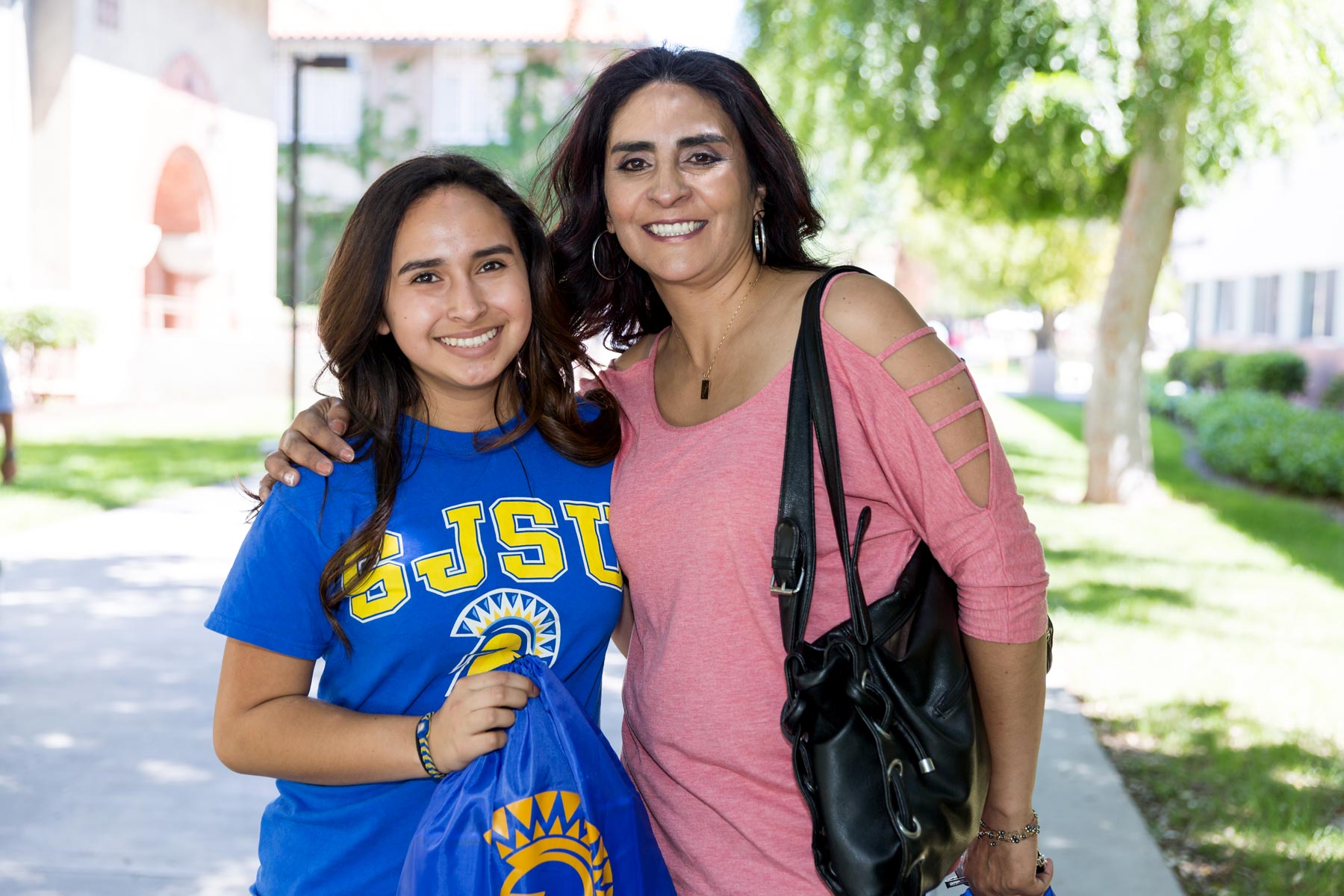
"Postcard" Component

Advisor talking to a student.
Text photo caption here

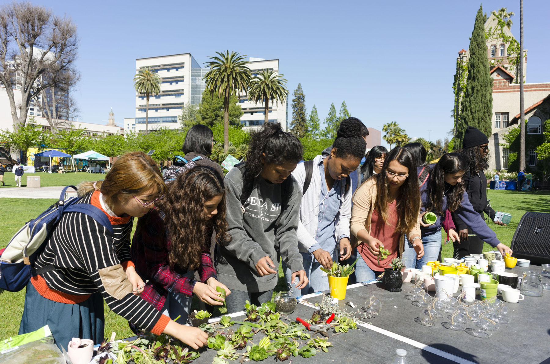
Showcase the Experience You Offer

The Postcard Component balances photography and text. Choosing an appropriate photo to convey your message is important, but the accompanying text should provide additional context or value for what you're trying to say.

"Media Object" Component

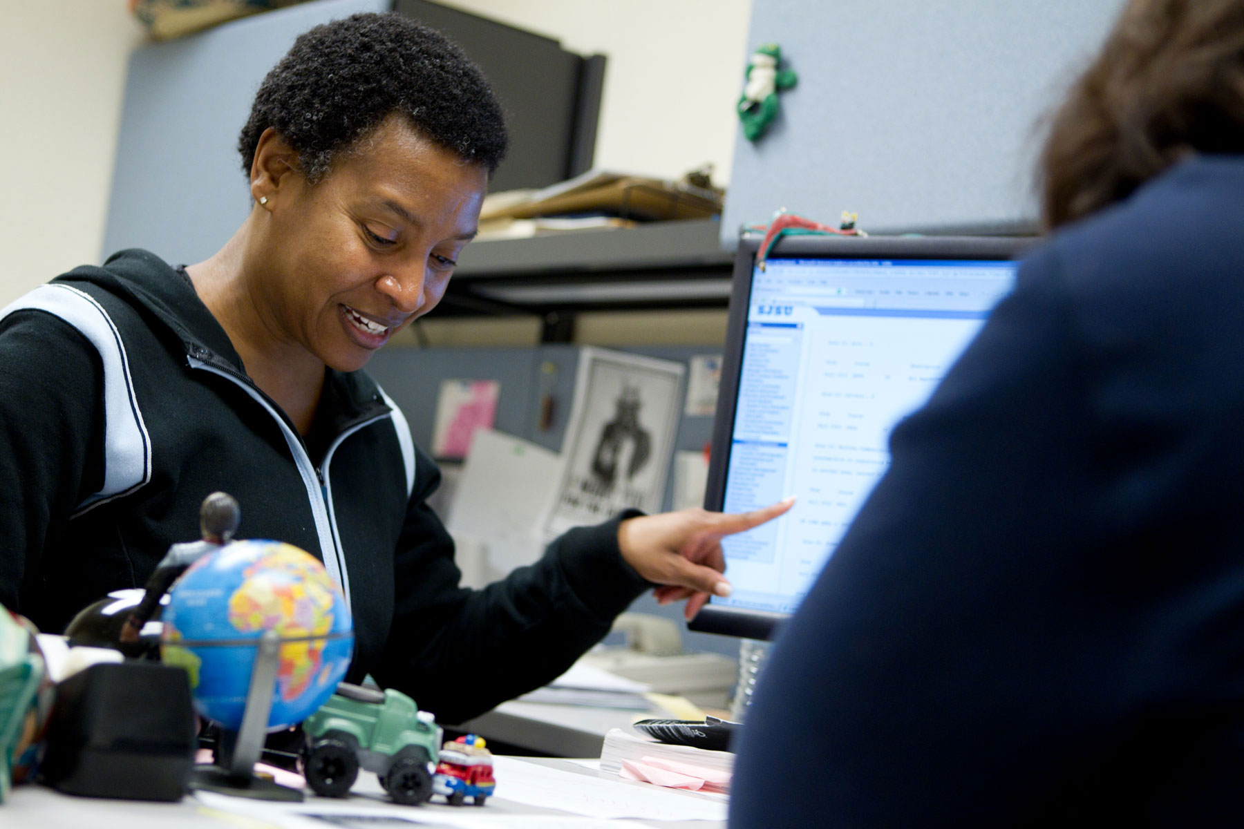
Need Simple Text Updates?

December 28, 2018

Sometimes you just need to let people know when something happened. The Media Object Component is good for presenting information that is less emphasized.

Happy New Year

January 22, 2019

This component features a special field to add a date, in addition to the normal image and call to action options.

Get Tickets

Artist rendering of the new rec center

Modularity Is Key

January 15, 2019

This component is expandable, allowing for many new "blocks" of content to be added, similar to the Card Component.

Just A Starting Point

While we're launching with a handful of components, the plan is that we will expand the library of options over time to address the needs that people have.

"Calendar" Component

"Hero" Component

An aerial view of campus, looking northwest towards the dorms and mountains beyond.

Do We Really Need A Hero?

A Hero Component features a large-scale, full-screen-width image. This is a great way to present a compelling image that shows off who you are and what you do at SJSU. But it should be used sparingly, and not just as a "pretty picture."

Give to SJSU

"Highlight" Component

A student and a parent pose for a photo on Admitted Spartan Day.

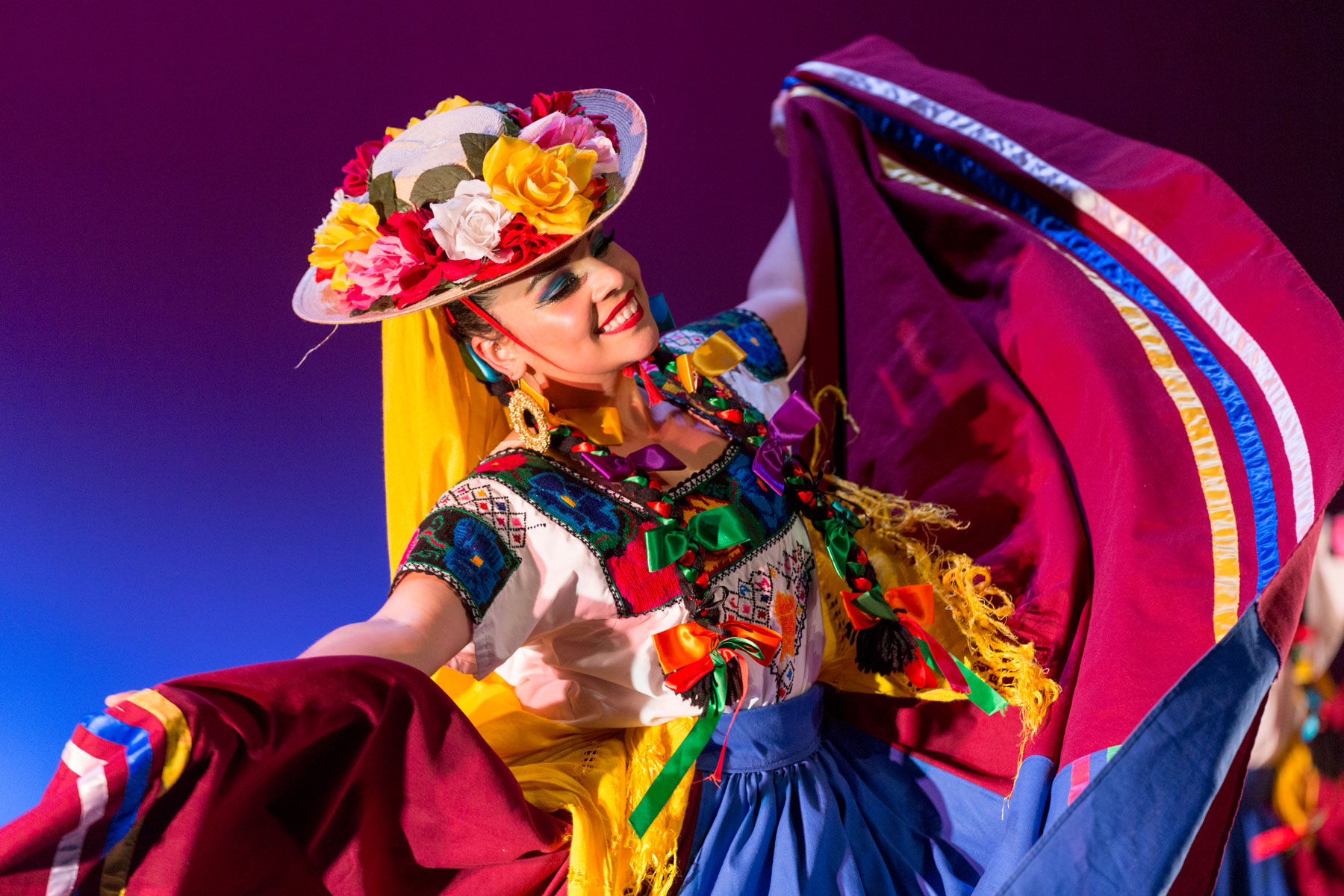
Pictures Tell A Thousand Words

An alternative to the Hero Component is the Highlight Component. Also featuring a wide image, it can showcase just as much visually, but be a better choice for when the available photography isn't suited for widescreen display.