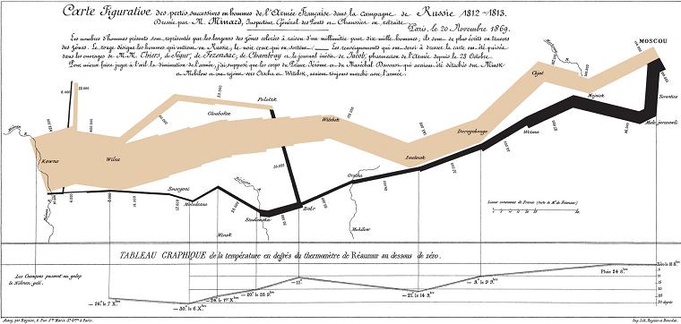
The December 19, 2007 issue of The Economist includes an article on how statistical charts are worth 1000 words. The statistical graphic above was drawn in the 19th century by Charles Joseph Minard. It depicts the advance into and retreat from Russia by Napoleon's Grande Armée, which was decimated by a combination of the Russian winter and the Russian army. As a statistical chart, the map unites six different sets of data. Geography: rivers, cities and battles are named and placed according to their occurrence on a regular map. The army's course: the path's flow follows the way in and out that Napoleon followed. The army's direction: indicated by the color of the path, brown leading into Russia, black leading out of it. The number of soldiers remaining: the path gets successively narrower, a plain reminder of the campaigns human toll, as each millimeter represents 10,000 men. Temperature: the freezing cold of the Russian winter on the return trip is indicated at the bottom. Time: in relation to the temperature indicated at the bottom.